A retro identity designed to play, pop, and perform
The Hull Doctor isn't just another hull cleaning company, it's on a mission to redefine what boat care can be. At its core, The Hull Doctor is about more than maintenance—it's about a passion for the water, a love of craftsmanship, and a deep respect for the boating lifestyle.
The existing branding, while functional, didn’t fully capture The Hull Doctor's playful, people-first approach. This rebrand needed to shift perceptions, positioning The Hull Doctor as the premier name for hull and dock maintenance, while injecting personality, emotion, and a sense of fun into the experience.

Unapologetically bold
and in-your-face
The Hull Doctor's ultra-bold typeface is no accident, it's deliberately bold, assertive, and impossible to ignore.
Boats are more than vessels; they bring people together and create lasting memories. They deserve expert care and respect to keep delivering those timeless moments on the water.
The logo says it all: at The Hull Doctor, we treat every boat with the attention it’s earned.


A logo that's as fun as it is thoughtful
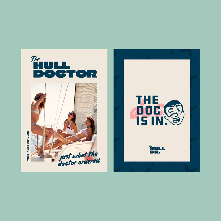
Meet the Doc—the joyful, quirky, and effortlessly cool mascot of The Hull Doctor. Designed with a retro, hand-drawn touch, the Doc embodies the spirit of the brand: a trustworthy blend of knowledge and playfulness. With his signature stethoscope and iconic goggles, he's not just a character, he's a symbol of the brand's ethos. His friendly smile and quaffed hair are a nod to the high-spirited, professional service itself, reinforcing the brand's commitment to exceeding expectations while maintaining a warm and inviting feel.


